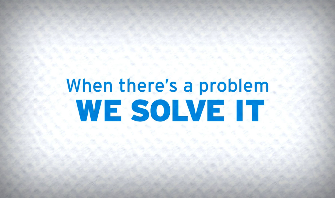
I spearheaded the creative direction of a transformative project for Ecolab, pivoting their brand narrative from a product-centric and chemistry-focused approach to a more human-centered, service-oriented direction.
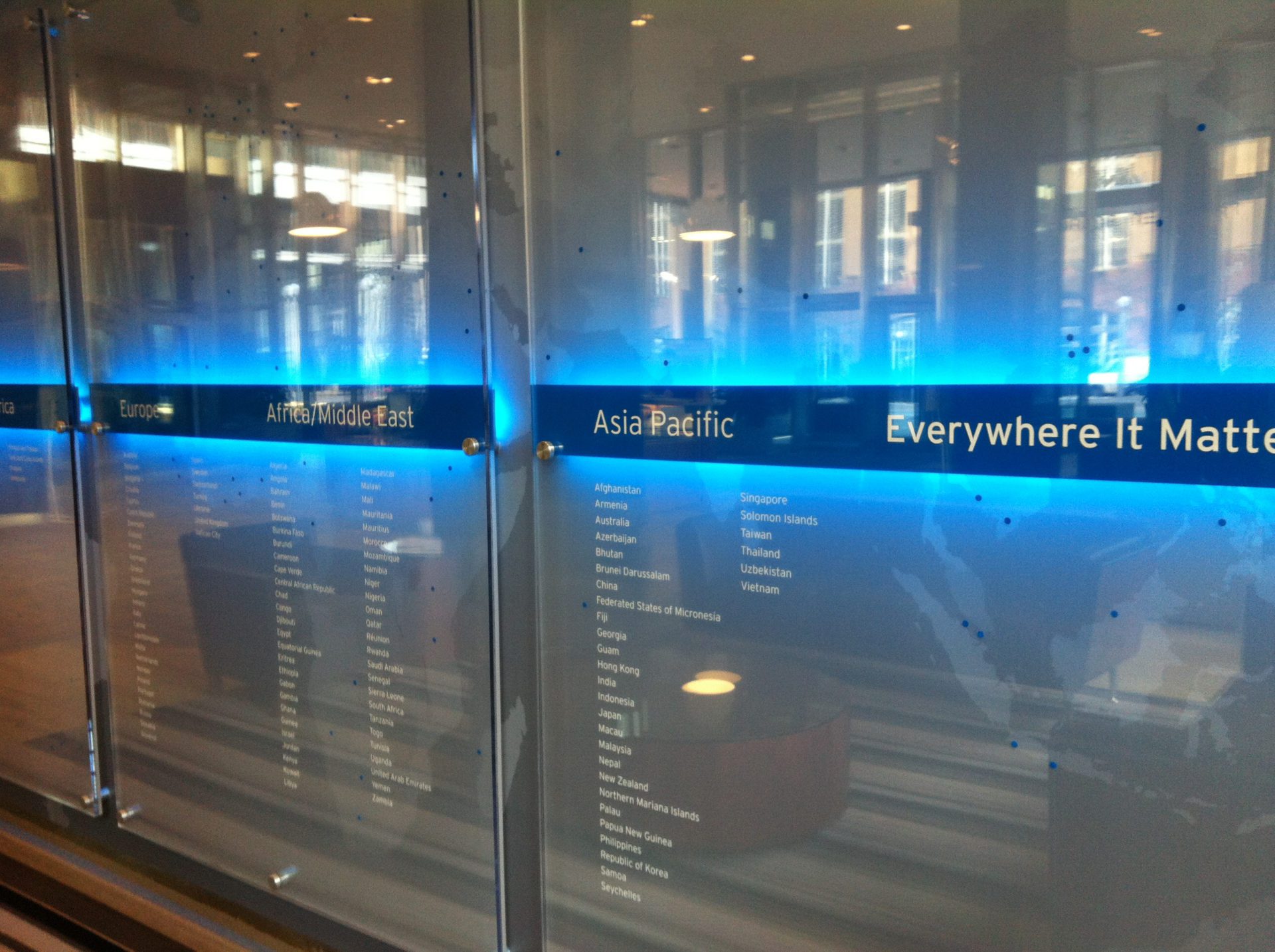
Everywhere It Matters
A Brand Platform designed to highlight all the places where Ecolab is making a difference in the world.
Challenge
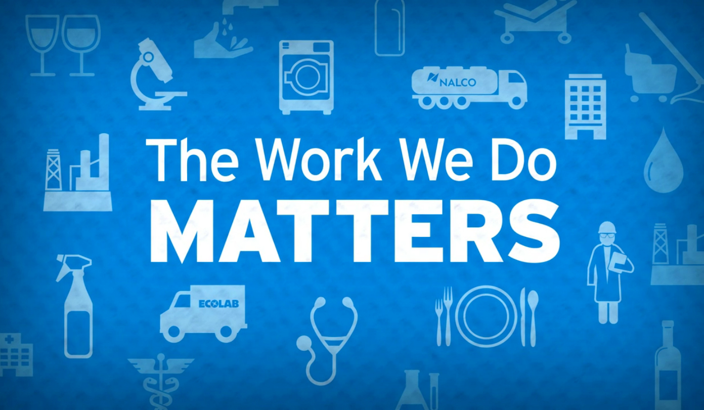
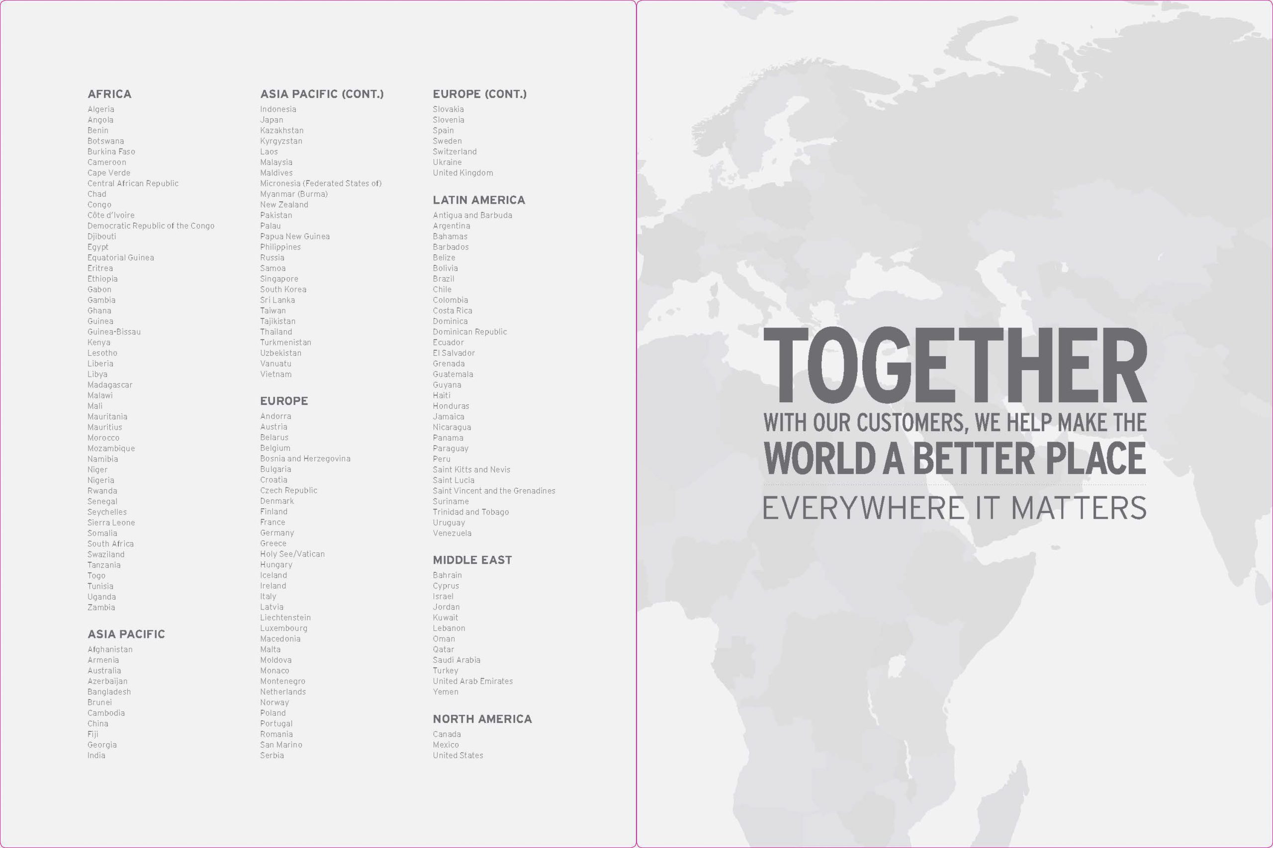
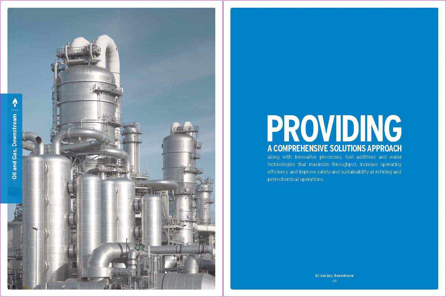
Ecolab was a nearly 100-year-old company operating in 170 countries but struggled with a cohesive brand identity. When the $9B company decided to merge with Nalco, a $8B company, it faced a unique challenge. The primary Ecolab products and services were related to cleaning, food safety, health, and hospitality, while Nalco was focused more on industrial systems, oil/gas, and water management.
On the surface, the merger seemed to be a conflict. Not only did the brand need to be re-focused, but there needed to be a story to share with the financial markets about how the combined company would be stronger.
Solution
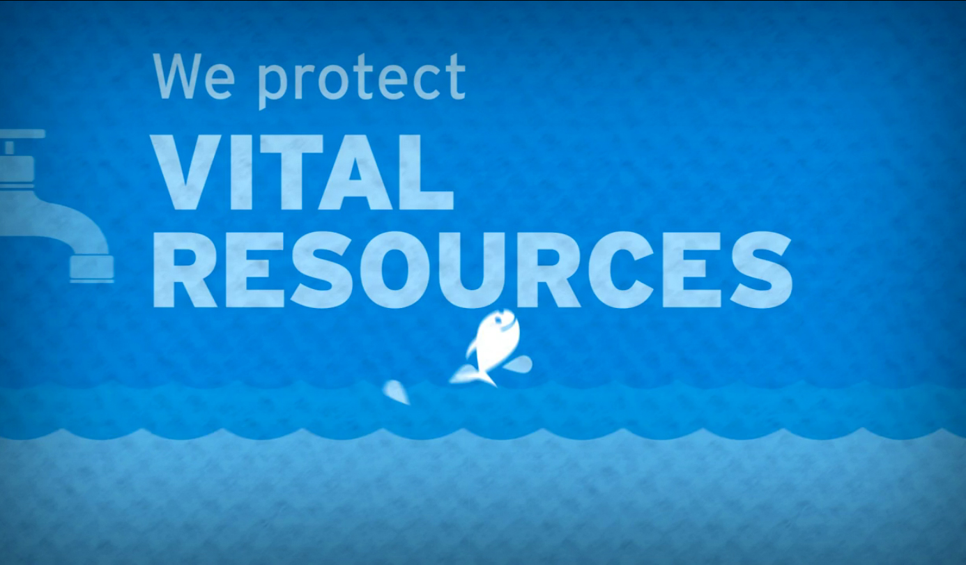
The newly combined company needed a new brand position and framework to guide the integration and launch the new company with a singular vision. The focus shifted towards highlighting Ecolab’s endeavors in safeguarding essential global elements and resources. This involved a comprehensive overhaul, creating fresh brand guidelines, a new visual and verbal style, and an innovative marketing strategy.
The project also included generating compelling content resonating with their new vision and positioning Ecolab as an impactful force dedicated to protecting vital resources globally.
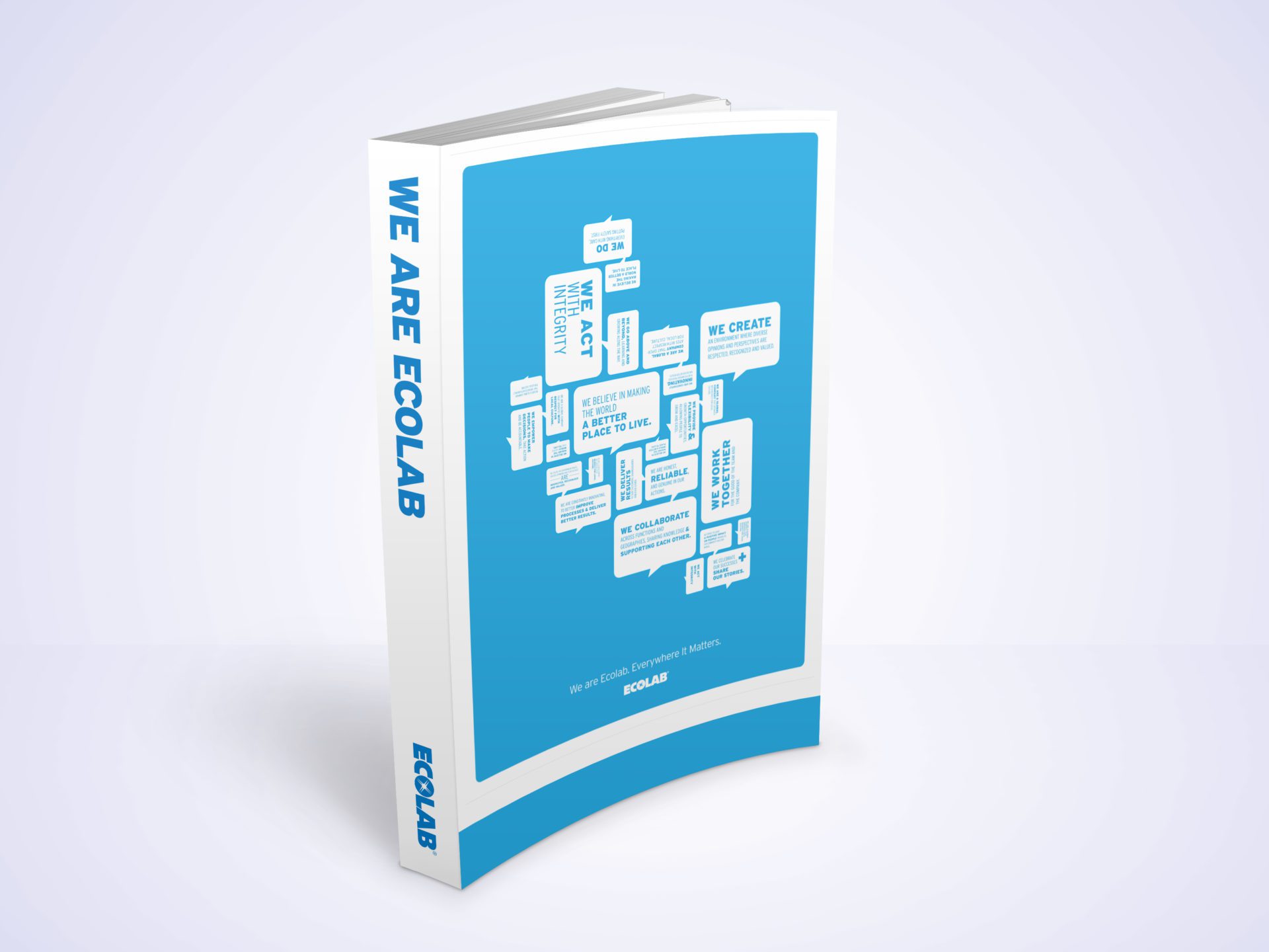
I was responsible for the brand vision, including developing a new visual styleguide, voice and tone, and visual platform to translate the brand around the world.
Why
The foundation for the new Ecolab campaign started with a simple question: why? When I was briefed on the assignment, the strategy and account team were focused on the products and services Ecolab offered to the market – washing machines, cleaning chemicals, uniforms, and more. While these were impressive, it wasn’t unique. I posed the question back to the team to say: Why do they make these items, sell these chemicals, and provide these services?
Because
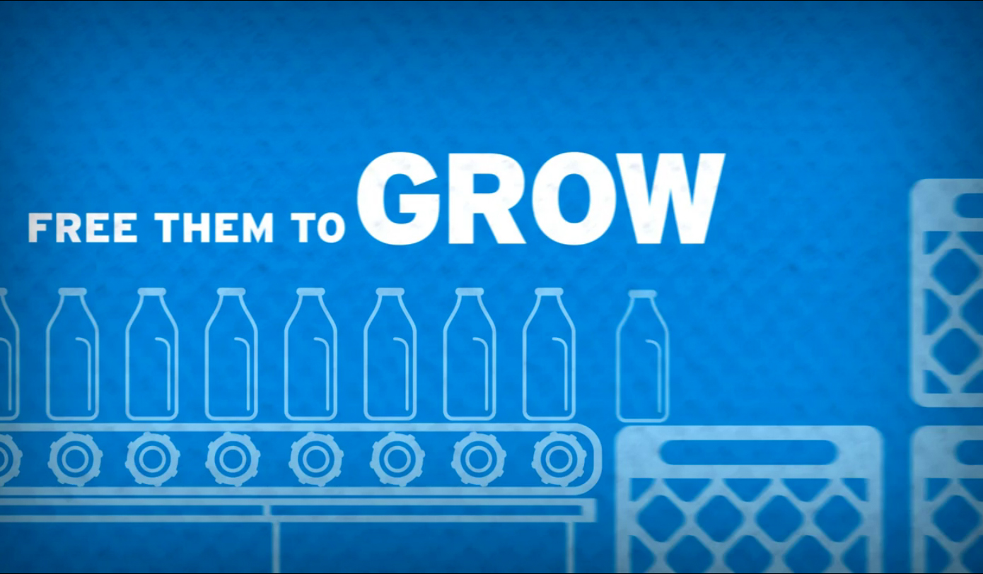
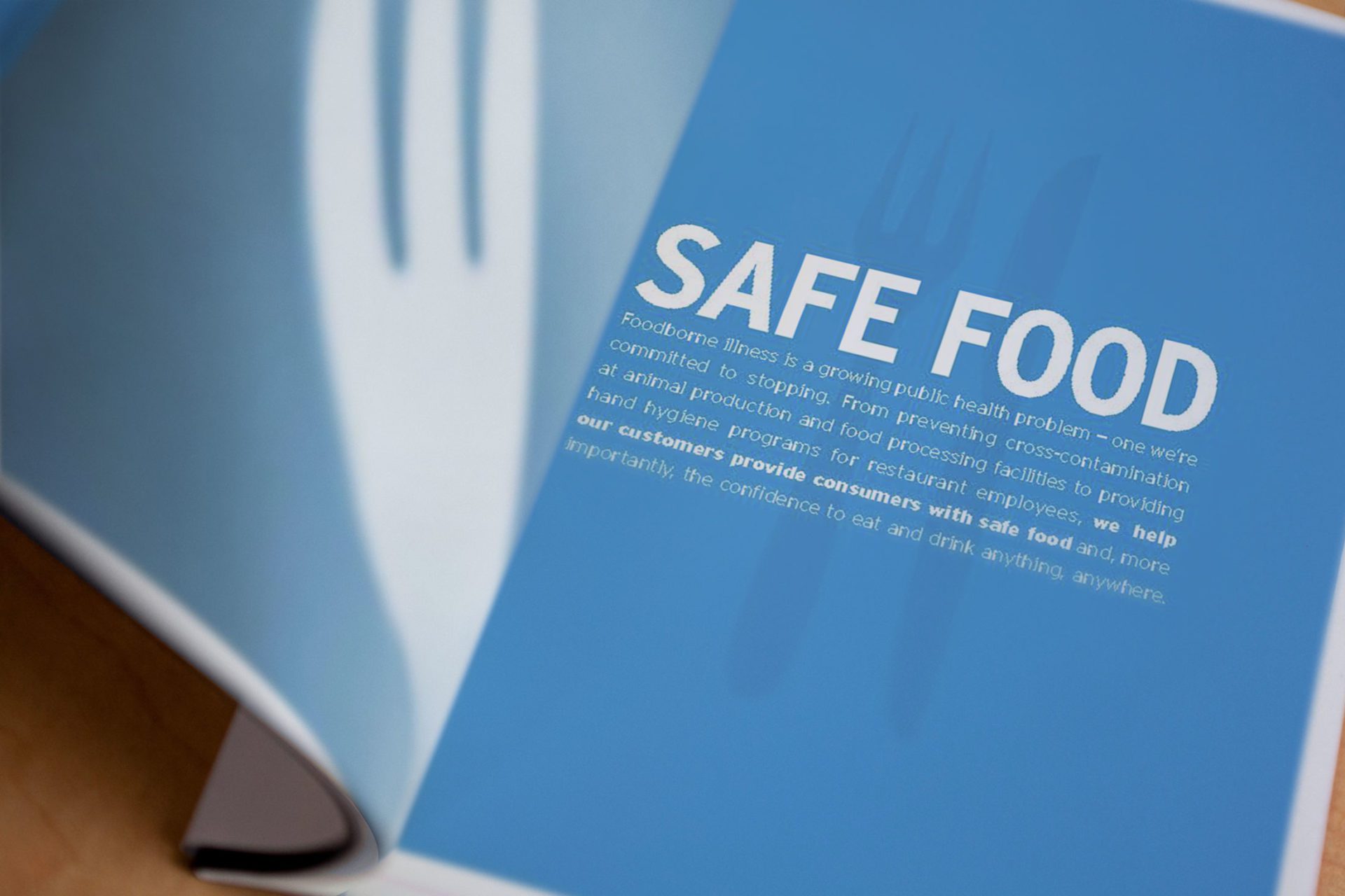
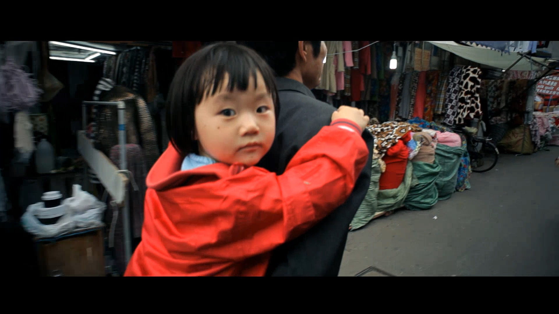
The reality was that the products and services provided by Ecolab did more than clean dishes, they provided safe food. They did more than sanitize hospitals, they provided places to heal. The answers were very simple, the equation just needed to be switched. The first part of the brand transformation effort was to begin with the middle. As such, I developed the first “Because” campaign that allowed the organization to talk about the results of their good work, not the products.


Creative Identity Challenge
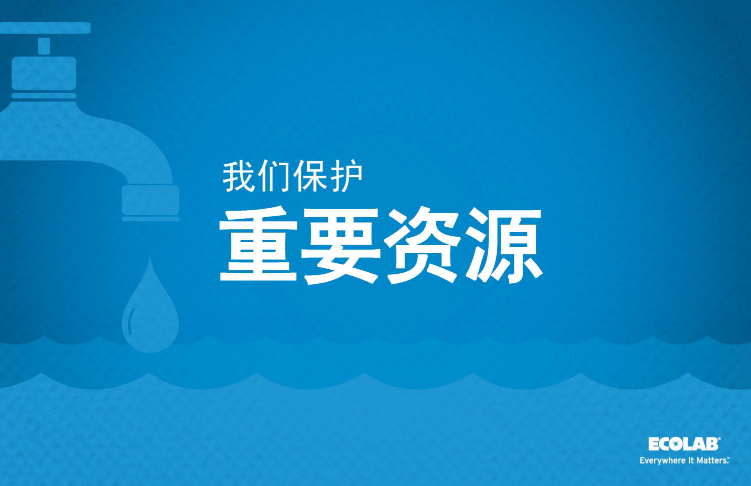
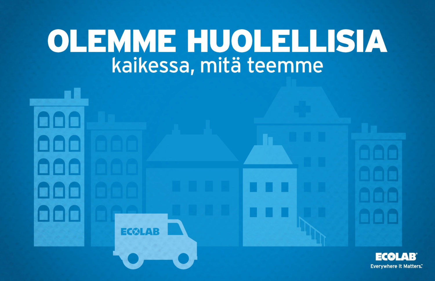
Developing a new visual style guide for Ecolab, especially one that can be translated into over 20 languages and localized for 170 countries, posed a significant challenge. The primary issue was that typical photo and video content would be inconsistent across diverse markets and prohibitively expensive. To overcome these hurdles, we embarked on a creative journey to establish a new, universally adaptable framework.
Creative Identity Solution
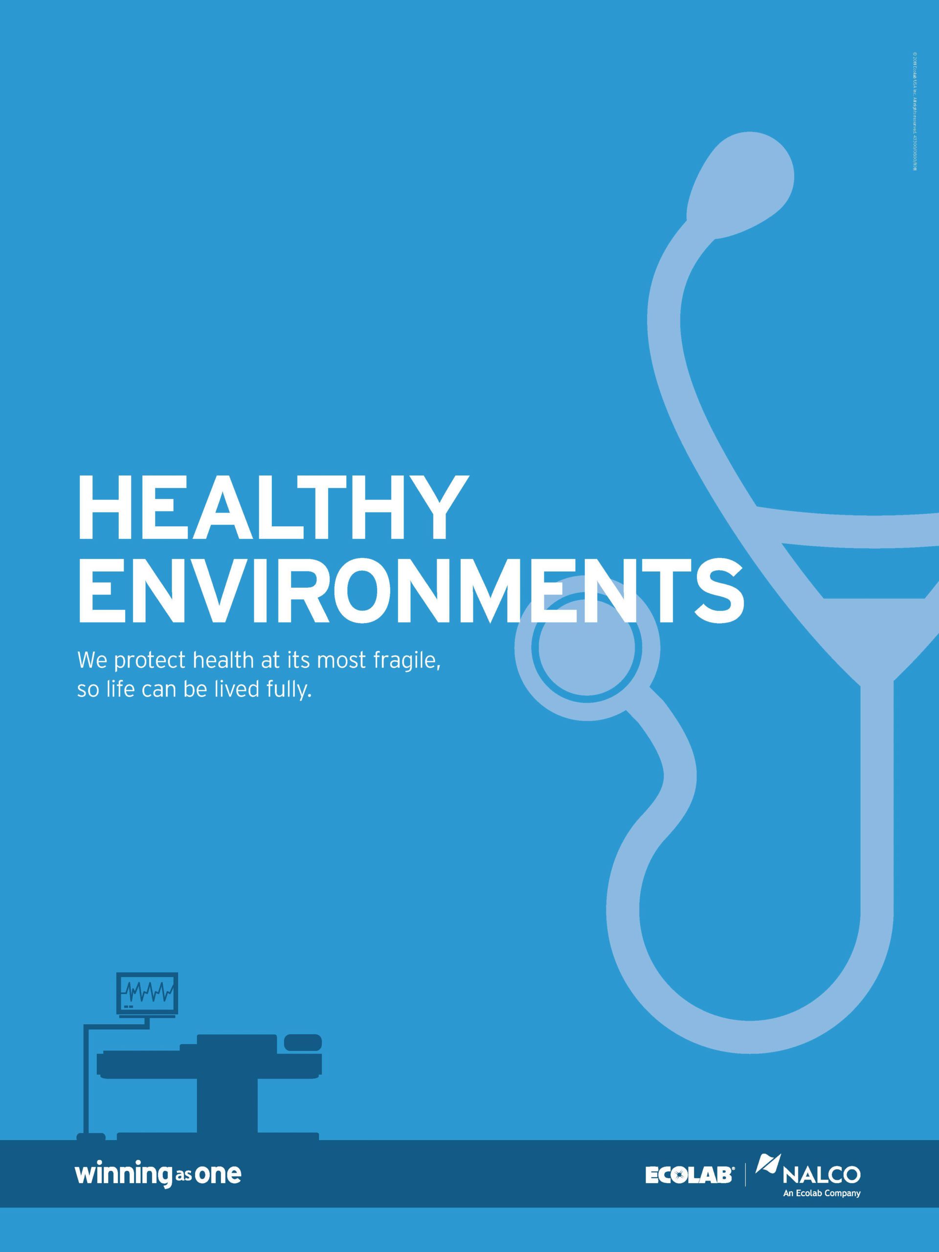
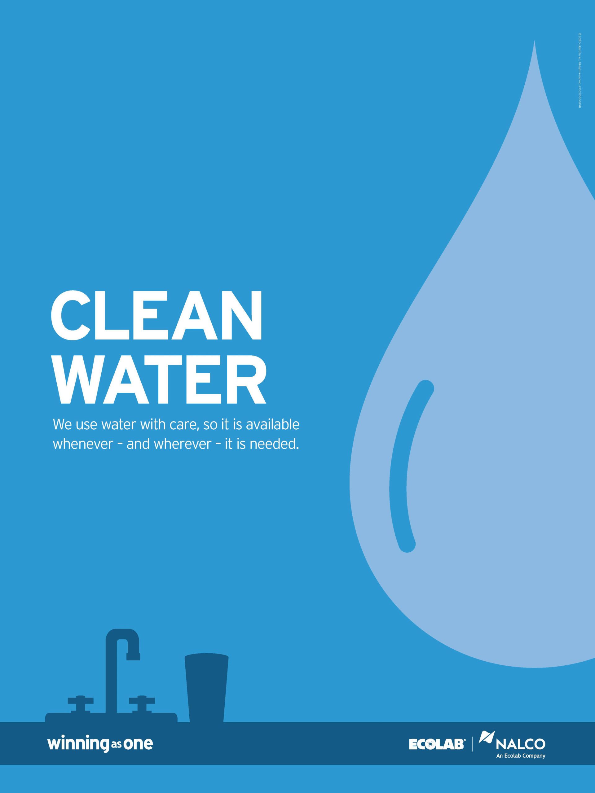
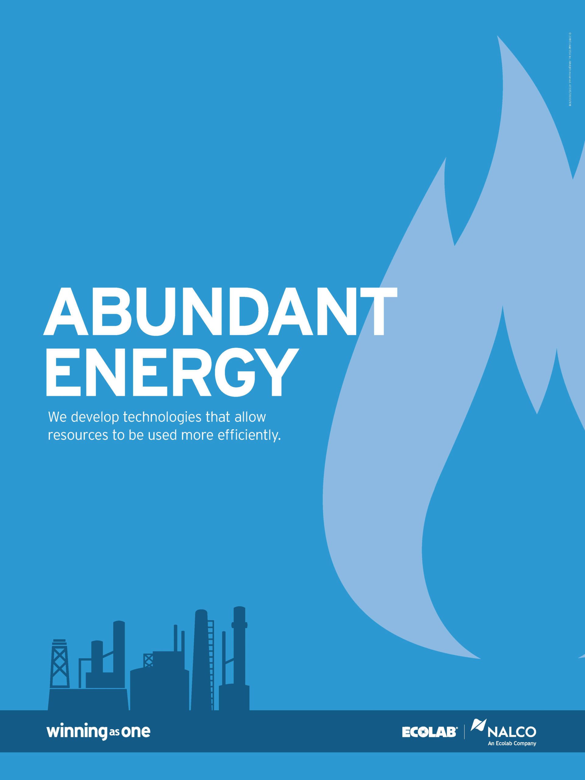
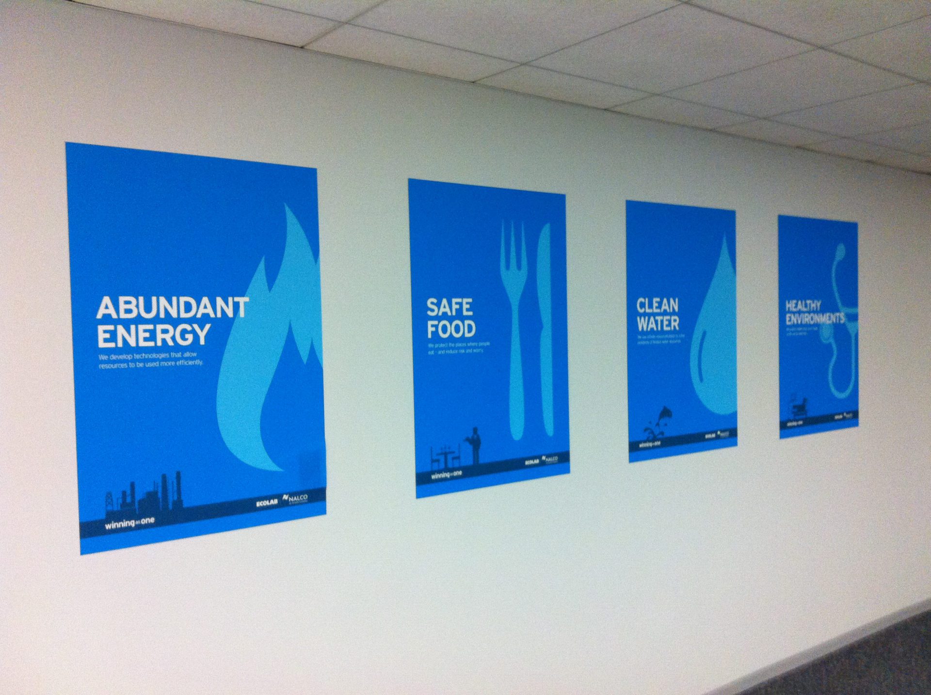
Our solution was to develop a series of iconic graphics, meticulously designed to be both simple and distinctive. These icons were crafted with a deep understanding of Ecolab’s brand identity, ensuring they were not just universally recognizable, but also uniquely ownable in the industry. The icons were designed to encapsulate the core values and services of Ecolab, translating complex ideas into clear, visual forms that transcend language and cultural barriers.
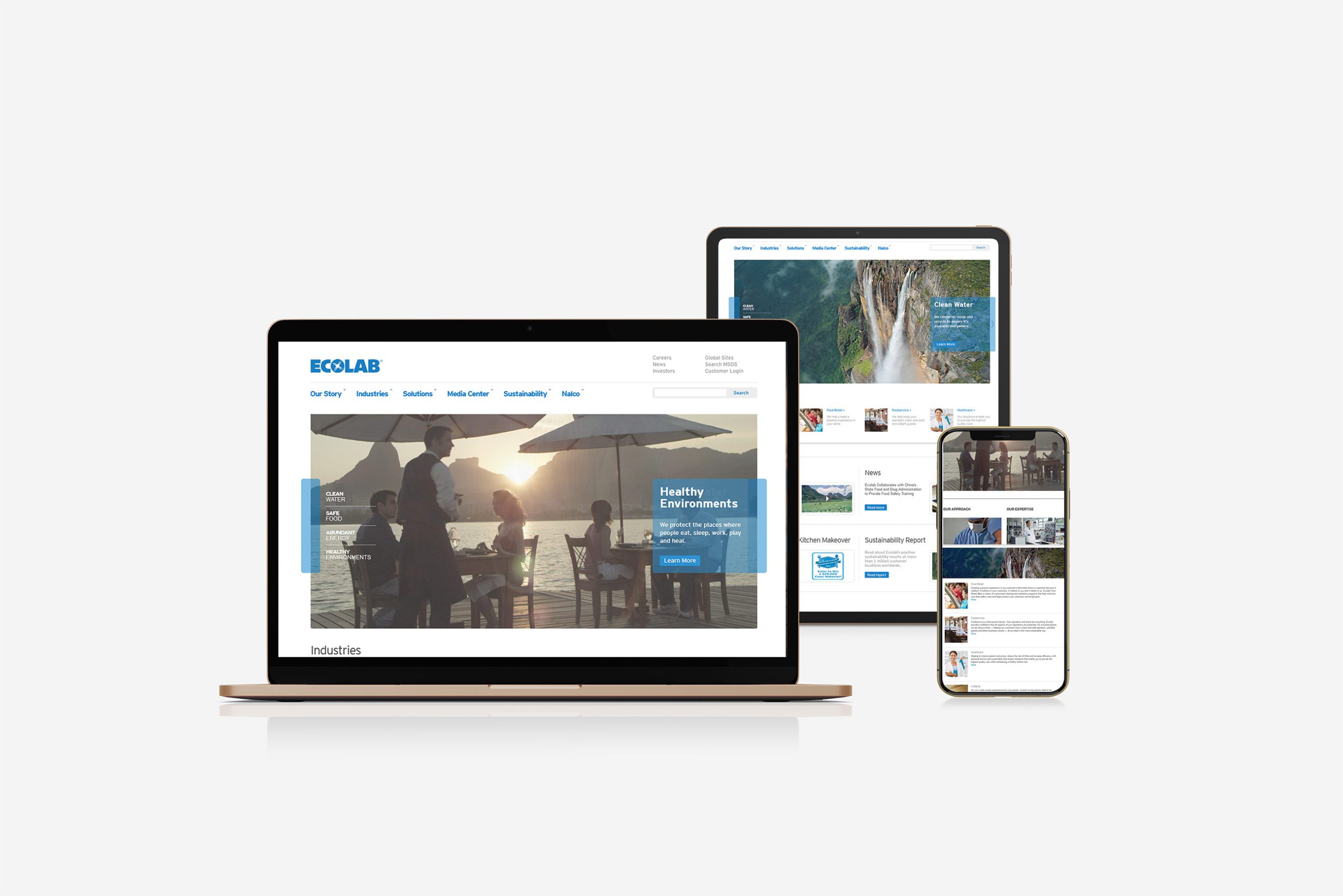
The Design System
This suite of icons and graphics were engineered to be highly versatile, suitable for various communication mediums including print, digital platforms, trade shows, and in-office displays. The simplicity of the design ensured ease of understanding, while their uniqueness made them stand out in a crowded market. The graphics were also created with scalability in mind, allowing them to be effectively used in both large-scale displays and smaller, digital formats.
Localization
To ensure the icons were effective across different cultures and languages, we engaged in extensive research and testing. This process involved collaboration with local teams in various regions to gather feedback and insights, ensuring the icons were culturally sensitive and resonant.
The result was a visually coherent, adaptable, and scalable set of graphics that provided Ecolab with a powerful tool for global communication. This new visual language not only aligned with the company’s innovative and global presence but also set a new standard in the industry for clear and culturally adaptable corporate communication.