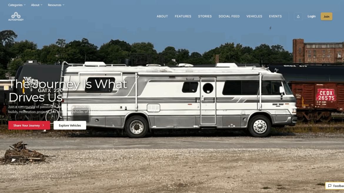
Brand

Catiki

1024 683 Michael Kraabel

Developed and managed tiki-inspired DTC consumer brand.

The Challenge

The Catiki Kingdom brand was started from the ground up, from the initial business concept all the way through to visual branding and product development.   The challenge was to create an irreverent brand that would tap into the feeling of nostalgia for good coctails and a slower pace of time.

The Solution

The Catiki brand was developed to introduce Tiki-style and Polynesian fashion to a younger generation of Americans. Seeing an open market for an industry. the company offers a unique blend of products directly to consumers. This includes custom designs, patterns, products, and associated inspiration.

Kauai Coffee

1024 683 Michael Kraabel

Designed and developed a variety of elements to bring the Kauai Coffee brand experience to life.  From the experience center to a subscription service.

The Challenge

The Kauai Coffee Company is one of those rare destinations in the world with such an incredible and authentic story that must be told to others.  Our challenge was to create a way that the Visitor Center experience could come to life, not only for those who visit but also for those who aspire to visit.

The Solution

After visiting the Kauai Coffee Visitor Center for the first time, I fell in love with the team members’ passion and enthusiasm for the company. Over several visits, I captured some of that essence on film and photography, helping to develop a unique brand book, a visitor center experience, and a catalog of beautiful photos taken around the estate.  The subsequent launch campaign included efforts to get visitors to the estate and subscribe to their DTC coffee subscription program.

Kauai Coffee Brand Photography

The Kauai Coffee Brand Book

Kauai Coffee Product Exploration

Ecolab

1024 765 Michael Kraabel

I spearheaded the creative direction of a transformative project for Ecolab, pivoting their brand narrative from a product-centric and chemistry-focused approach to a more human-centered, service-oriented direction.

Everywhere It Matters

A Brand Platform designed to highlight all the places where Ecolab is making a difference in the world.

Challenge

Ecolab was a nearly 100-year-old company operating in 170 countries but struggled with a cohesive brand identity. When the $9B company decided to merge with Nalco, a $8B company, it faced a unique challenge. The primary Ecolab products and services were related to cleaning, food safety, health, and hospitality, while Nalco was focused more on industrial systems, oil/gas, and water management.

On the surface, the merger seemed to be a conflict. Not only did the brand need to be re-focused, but there needed to be a story to share with the financial markets about how the combined company would be stronger.

Solution

The newly combined company needed a new brand position and framework to guide the integration and launch the new company with a singular vision. The focus shifted towards highlighting Ecolab’s endeavors in safeguarding essential global elements and resources. This involved a comprehensive overhaul, creating fresh brand guidelines, a new visual and verbal style, and an innovative marketing strategy.

The project also included generating compelling content resonating with their new vision and positioning Ecolab as an impactful force dedicated to protecting vital resources globally.

I was responsible for the brand vision, including developing a new visual styleguide, voice and tone, and visual platform to translate the brand around the world.

Why

The foundation for the new Ecolab campaign started with a simple question: why?  When I was briefed on the assignment, the strategy and account team were focused on the products and services Ecolab offered to the market – washing machines, cleaning chemicals, uniforms, and more.  While these were impressive, it wasn’t unique.  I posed the question back to the team to say: Why do they make these items, sell these chemicals, and provide these services? 

Because

The reality was that the products and services provided by Ecolab did more than clean dishes, they provided safe food.  They did more than sanitize hospitals, they provided places to heal.  The answers were very simple, the equation just needed to be switched.  The first part of the brand transformation effort was to begin with the middle.  As such, I developed the first “Because” campaign that allowed the organization to talk about the results of their good work, not the products.

Creative Identity Challenge

Developing a new visual style guide for Ecolab, especially one that can be translated into over 20 languages and localized for 170 countries, posed a significant challenge. The primary issue was that typical photo and video content would be inconsistent across diverse markets and prohibitively expensive. To overcome these hurdles, we embarked on a creative journey to establish a new, universally adaptable framework.

Creative Identity Solution

Our solution was to develop a series of iconic graphics, meticulously designed to be both simple and distinctive. These icons were crafted with a deep understanding of Ecolab’s brand identity, ensuring they were not just universally recognizable, but also uniquely ownable in the industry. The icons were designed to encapsulate the core values and services of Ecolab, translating complex ideas into clear, visual forms that transcend language and cultural barriers.

The Design System

This suite of icons and graphics were engineered to be highly versatile, suitable for various communication mediums including print, digital platforms, trade shows, and in-office displays. The simplicity of the design ensured ease of understanding, while their uniqueness made them stand out in a crowded market. The graphics were also created with scalability in mind, allowing them to be effectively used in both large-scale displays and smaller, digital formats.

Localization

To ensure the icons were effective across different cultures and languages, we engaged in extensive research and testing. This process involved collaboration with local teams in various regions to gather feedback and insights, ensuring the icons were culturally sensitive and resonant.

The result was a visually coherent, adaptable, and scalable set of graphics that provided Ecolab with a powerful tool for global communication. This new visual language not only aligned with the company’s innovative and global presence but also set a new standard in the industry for clear and culturally adaptable corporate communication.

The Unplug Project

1024 576 Michael Kraabel

A movement to increase awareness of the negative side-effects of consuming too much digital media.

The Unplug Project is a initiative aimed at encouraging individuals to consciously disconnect from the digital world and reconnect with the essence of real-life experiences. The project promotes mindful use of technology, advocating for regular digital detoxes and a more analog lifestyle.

Project Foundation + Core Beliefs

Like many, I found myself deeply entrenched in the digital world. My days were a blur of emails, social media, and a constant bombardment of notifications. Technology, which was supposed to be a tool, had become my master. It dictated not just my work, but also my personal life, straining my relationships and disconnecting me from the real world.

Creating A Movement

One evening, as I sat with my family, glued to my phone while they conversed and laughed, a profound realization hit me. I was physically present, but emotionally and mentally, I was miles away, lost in the digital ether. It was this moment that sparked a desire for change – a need to reclaim the life that technology was stealthily stealing from me.  View the project at unplug.pro.

AVIV 613 Vodka

1024 682 Michael Kraabel

As the acting Creative Director for AVIV 613 Vodka, my role encompasses overseeing every facet of the brand’s design, content creation, launch events, and marketing assets. Working in tandem with the founder and CEO, I’ve been instrumental in bringing their visionary concepts to life.

Brand Foundation + Core Beliefs

At AVIV Vodka, the core belief revolves around embracing gratitude as the gateway to a life filled with joy and satisfaction. It’s about acknowledging the present, valuing the positive elements in one’s life, and appreciating the people who shape it.

The concept of genuine wealth isn’t tied to material possessions; instead, it’s found in nurturing relationships, cherishing moments of happiness, and investing time and effort in the community and meaningful causes—a richness that transcends monetary value.

Telling a Brand Story

AVIV 613 Vodka symbolizes a vessel for spiritual enrichment, amplifying blessings and toasts, infusing them with a deeper energy. Each pour becomes a ritual, an opportunity to celebrate the goodness in today’s happenings, fostering a more positive and spiritually rich environment.

Collaborating closely, we’ve developed an array of assets essential for marketing strategies, aligning with the brand’s ethos, and extending to in-store and on-location marketing. This involved curating a visual identity, crafting engaging content, and orchestrating captivating launch events that encapsulated the essence of AVIV 613 Vodka, aiming to leave a lasting impression on consumers and stakeholders alike.

Smart Sense

1024 683 Michael Kraabel

Developed a comprehensive marketing campaign to highlight the importance of protecting your home’s gas appliances.  A simple device can save you from a dangerous situation.

Challenge

Crafting a marketing strategy for a small connector fitting that attaches to a gas line, especially one that is typically concealed behind appliances, poses a unique challenge. This connector, although small and often out of sight, plays a crucial role in ensuring the safety and efficiency of household appliances. The primary difficulty lies in highlighting its significance in a way that resonates with consumers who rarely see or think about this component.

Solution

We needed to emphasize the connector’s reliability, durability, and crucial role in maintaining a safe home environment. This required innovative approaches that visually and conceptually brought this hidden but essential component to the forefront of consumer consciousness.  We burned down a house to show what happens when you don’t have this little device.

360 Degree House Fire Experience.

Digital Lead Generation Flow

Bishop+Rook

1024 683 Michael Kraabel

Bishop+Rook Trading Co. specializes in the import, restoration, and bespoke building of vintage Land Rover Defenders.

Introducing Bishop+Rook

We specialize in sourcing, importing, and building vintage Land Rovers and Heritage Land Rover Defenders. We aim to ensure each vehicle we source or build retains its unique character, whether it’s an unrestored classic with original patina or a complete nut-and-bolt restoration.

With years of experience in the industry, Bishop+Rook has become one of the most recognized companies in the world for creating truly unique and classic Land Rover Defenders. We maintain operations in the US, UK, Spain, and sourcing operations through the entire EU to ensure a steady supply of interesting and unique Defenders to bring to the market.

The Brand Story

Since the beginning of the company, we have ventured to bring our customers along with the journey. We publish an extensive amount of material to help guide prospects through the adoption process.  We show what takes place behind-the-scenes in the workshop, believe in radical pricing transparency, and offer support to anyone considering owning a vintage Land Rover.

The company was started in late 2014 as a passion project but evolved and expanded over the years to become a leading full-service Land Rover Restoration company – with workshops worldwide.  We continue to maintain our status as an employee-owned company over the years – knowing that true craftsmanship can only come from hands-on work completed in our own workshops.

Stratasys – Rebrand

1024 683 Michael Kraabel

Led an effort to rebrand one of the pioneers in the additive manufacturing and 3D printing industry.

STRATASYS

Global Rebranding

The Challenge

In a time when 3D printing was hitting mainstream news and investors were looking at the category with greater interest, Stratasys lacked a cohesive brand story and vision. My team lead a global strategic analysis that ultimately led to the recommendation to rebrand and align all divisions under a new unified brand system.

The Solution

My team developed an entirely new brand system, story, go-to-market strategy, and vision for the 3D printing market.

Brand Line:

The 3D Printing Solutions Company.

Purpose:

We shape lives by revolutionizing the way things are made.

Position:

Stratasys is the trusted leader in innovative 3D Printing and manufacturing solutions that empower individuals and organizations to transform the way they imagine, design and make things.

Pace Labs

1024 576 Michael Kraabel

Had the absolute pleasure to work with one of the most important unknown companies in the world to develop a comprehensive brand platform.

BRAND PURPOSE

Inspired to Protect

Inspired to the leave the environment, your health and your business better than we found it.

Challenge

Pace Analytical, also known as Pace Labs, is a company specializing in environmental and life sciences testing services. They provide a wide range of analytical testing services to support environmental investigations focused on air, water, soil, waste, and other matrices. Pace Analytical is known for its state-of-the-art laboratories equipped with advanced technology and staffed by experienced scientists and technicians.

Solution

Pace Analytical challenged me to develop a comprehensive brand platform that would unify their service and present a clear and concise message to the marketplace. This was designed to Build Trust and Credibility, Connect with Clients on a Deeper Levels, Enhance Employee Engagement and Pride, Facilitate Clear and Consistent Messaging, and Support Long-Term Growth and Adaptability.

Importance of Brand Foundation

Differentiation in a Competitive Market: The environmental and analytical testing industry is highly competitive. A strong brand story helps Pace Labs stand out by highlighting its unique strengths, expertise, and the value it offers to clients. This differentiation is key to attracting and retaining customers.

Building Trust and Credibility: In an industry where accuracy and reliability are paramount, a cohesive brand story can establish Pace Labs as a trustworthy and credible choice. It reassures clients that they are working with experts committed to quality and precision.

Connecting with Clients on a Deeper Level: A compelling brand story goes beyond just marketing products or services; it connects emotionally with clients. By communicating its mission, vision, and values, Pace Labs can foster a deeper connection with its audience, which is essential for long-term customer relationships.


Enhancing Employee Engagement and Pride: A well-articulated brand story can also boost internal morale and engagement. Employees who understand and align with the company’s purpose are more motivated and take pride in their work, leading to better performance and employee retention.

Facilitating Clear and Consistent Messaging: With a cohesive brand story, all marketing and communication efforts become more streamlined and consistent. This clarity ensures that every piece of communication reinforces the company’s core message, making marketing efforts more effective.

The Importance of Safe

Inspired to Protect

Inspired to the leave the environment, your health and your business better than we found it.

TRUTH

Data is truth and truth is powerful. Sound science is more important now than ever.

INTEGRITY

Results you can trust. Committed to our values and yours.

INNOVATION

Always learning and improving. Never losing our values.

PARTNERSHIP

Working together with trust and transparency.

Environmental Science

Protecting the environment

Life Science

Protecting your health

Scientific Professional Services

Protecting your business

Stratasys Anthem

1024 576 Michael Kraabel

Wrote, Directed, and Edited a new anthem spot to introduce the newly launched Stratasys brand to the world.

The 3D Printing Solutions Company

Challenge

Stratasys, the leader in 3D printing and additive manufacturing, had recently undergone a significant global rebranding to unify its diverse divisions. This pivotal moment calls for a compelling narrative that reflects our new, cohesive identity and resonates with our market. The company needed to craft a story that captures the spirit of Stratasys’ transformation, showcasing the innovation and connecting with their audience as they embarked on this new chapter.

Solution

In addressing Stratasys’ global rebranding, we developed a script that intricately wove together the unique stories of each division, illustrating their collaborative efforts in advancing the industry and fostering innovation. This script was brought to life through an anthem video, crafted from diverse footage gathered during the brand anthropology and Distil workshop sessions. This approach successfully showcased the unified strength of Stratasys’ divisions, creating a compelling and inspiring narrative that resonated deeply with our audience and solidified Stratasys’ position as a leader in the 3D printing and additive manufacturing industry.